7/2/2025 · Portfolio Admin
Adopting the BEM Naming Convention for Scalable CSS
Synced from Medium RSS
“Write CSS like a pro — without the chaos.”
What Is BEM, and Why Should You Care?
If you’ve ever written CSS for more than a few pages, you’ve probably hit a wall:
- Class names start clashing
- Styling one component breaks another
- You’re scared to touch anything 😅
That’s where BEM — short for Block, Element, Modifier — comes in. It’s not a new CSS framework or language. It’s just a naming convention that brings clarity, scalability, and peace of mind to your styles.
The Core Idea of BEM
Let’s break it down:
|-----------|------------------------------------------|------------------------------------|
| Block | The standalone component | `card` |
| Element | A part of the block | `card__title` |
| Modifier | A variation of the block or element | `card--dark`, `card__title--big` |
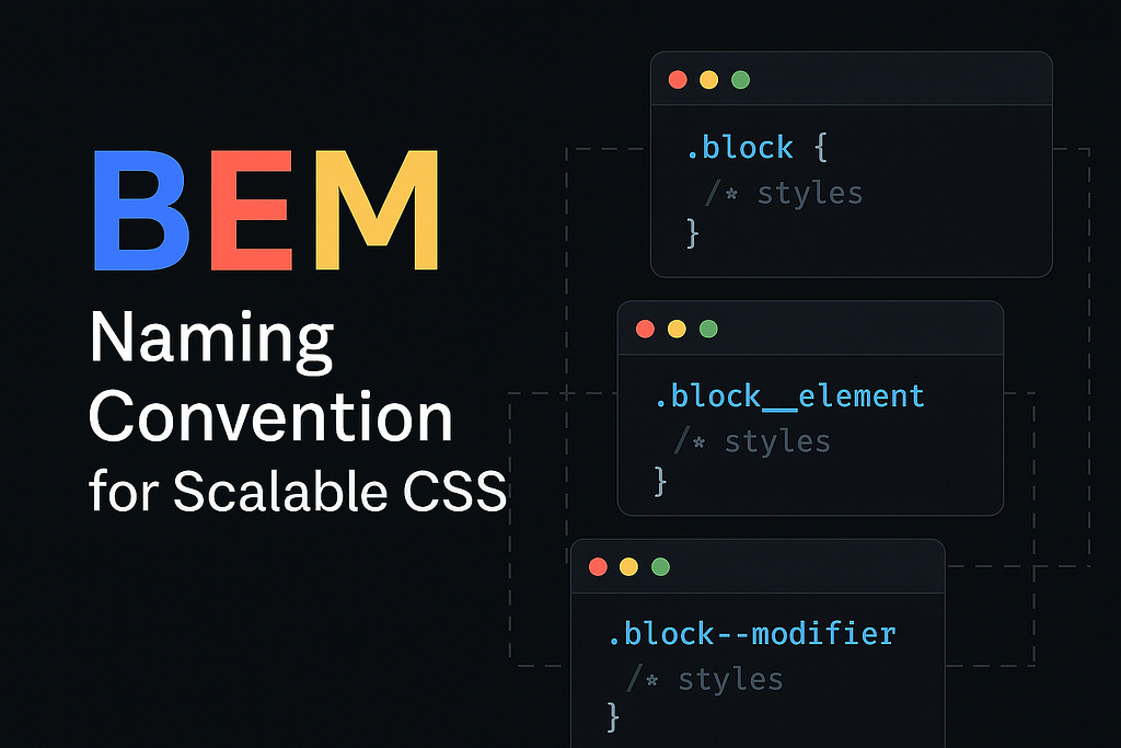
Syntax Format:
.block {}
.block__element {}
.block--modifier {}
.block__element--modifier {}
So instead of writing something vague like .title or .active, BEM forces you to be specific and intentional.
Real-World Example: A Blog Card
Imagine you’re building a blog card. Without BEM, your CSS might look like this:
<div class="card">
  <h2 class="title">Top 5 CSS Tips</h2>
  <p class="description">Learn how to write cleaner CSS...</p>
</div>
This works, until you create another component that also has .title or .description.
With BEM:
<div class="card card--highlighted">
  <h2 class="card__title">Top 5 CSS Tips</h2>
  <p class="card__description">Learn how to write cleaner CSS...</p>
</div>
.card {
  border: 1px solid #ccc;
}

.card--highlighted {
  background-color: #f9f9f9;
}

.card__title {
  font-size: 1.2rem;
}

.card__description {
  color: #666;
}
Suddenly, everything makes sense. You can:
- Reuse .card in multiple places
- Extend it with modifiers like --highlighted, --featured
- Never worry about class name collisions.
Why Beginners Should Use BEM?
Even if you’re just starting with CSS, adopting BEM will:
- 📦 Help you organize your styles like LEGO bricks
- 💥 Avoid conflicts between components
- 🔍 Make your code readable and easier to debug
- 🧩 Scale your project without turning it into a spaghetti mess
And if you’re working on a team, it’s a game-changer.
BEM + Modern Tools
You can use BEM with plain CSS, SCSS, or even utility-based frameworks like Tailwind (by combining naming patterns smartly). But it really shines when:
- Writing component-based UI (React, Angular, Vue)
- Building design systems
- Working with large teams
There are even BEM linters for stylelint to enforce conventions.
Pro Tips for BEM Beginners
- Don’t overthink modifiers. Use them only when truly needed.
- Keep blocks as self-contained as possible.
- Avoid deeply nested elements (block__element__anotherElement is a red flag 🚩)
- Use tools like Emmet or snippets in VSCode to speed up typing BEM classes.
Final Thoughts
BEM isn’t the only way to write CSS, but it’s one of the most battle-tested approaches. It brings structure, scalability, and sanity — especially as your project grows.
So next time you start a component, think in BEM:
“What’s my block? What are its parts? And what needs variation?”
Stick with it for a few days, and it’ll become second nature.
Want BEM Cheatsheets or Starter Templates?
Let me know in the comments or DM me — I’ll share templates I use in real-world projects.
If You Found This Helpful…
Drop a ❤️, follow for more frontend insights, and share with your dev buddy who’s still naming things .box1 and .box2